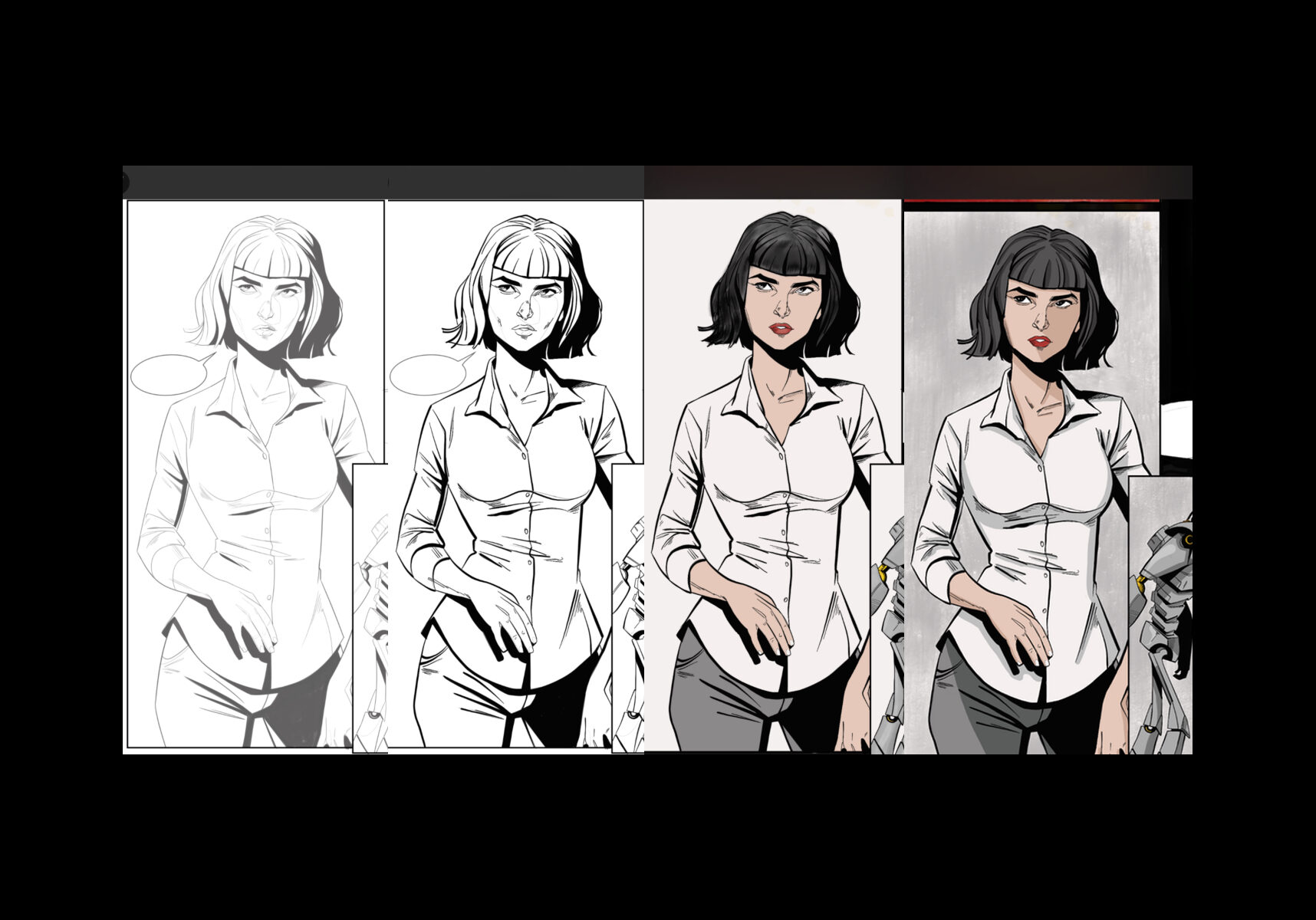
Chasing Light & Shadow
Adding highlights and lowlights (shadows) to a panel give it depth and shape. For me it always helps me to grasp speed and direction of movement as well. A well placed shadow can define a panel and really make or break a final piece. My personal preference is to use highlights sparingly. I find it distracting when a piece of art is so chok-a-bok full of light sources and highlights and end up paying more attention to them than the underlying art and story it's trying to convey. Everyone's different, by I prefer lowlights or shadows to bring a piece to its final stages.
Lettering
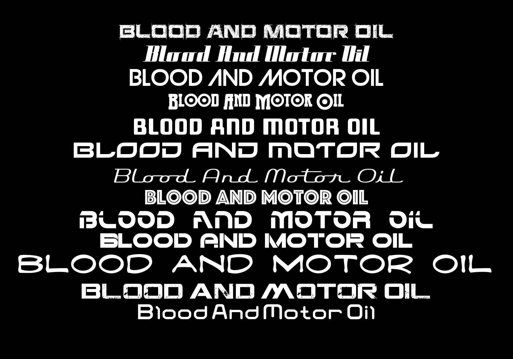
Could you spend hours trying to find the right font that perfectly expresses your carefully written words? Fonts and a lettering genius can create auditory tangibility out of written script text. When you see a particular font, or typeface, it immediately elicits a response in the reader that has become so second nature that we almost forget that Lettering in and of itself is an art form. The Letterer is charged with communicating the writers words in a way that invokes feeling, voice, tenor, and sound strength. How many of you will read ALL CAPS and hear your inner monologue yell those words? The letterer is also charged with finding a place for flowing dialogue within the art of the page. Using space to incorporate the lettering, instead of making it look separate, or unnatural. My preference is that each character has a different vocal font, specific to their voice, as well as any narration or banner line text.


Book Layout
With the illustrator in charge of the panel layout for each story page, any of the other pages that are not part of the story still need attention. Covers, title page, acknowledgment page, legalese page, accolades page, and then adding barcodes, reviews, credits, thanks. All have to find their way into a page and still look clean, coifed, and put together in a way that is eye pleasing. Another often forgotten part of laying out a story, is the way the pages will work together. 2 pages that will be open together will have a more cohesive feel, than 2 pages spread over a page turn. There are tried and true methodologies that some people stand by because they have proven to work when placing a barcode, or Cover banner location. Another side of this is uniformity. With a big publisher, many titles share similar layouts because it brings a uniform look to the entirely of the catalogue.
Would you like to know more?
Posts chronicling the making of a graphic novel. From concept to comic.
